Charting using data collected one-minute monitoring is essential to identify losses and to visualize actual savings. Yes, you can do away with such data and use one-time measurements but sustainability wwill always be a question!
Our software is capable of advanced data analysis which can be used to determine actual performance versus design. The charts below shows how we found
that a chiller was under-performing possibly faulty sensors, low refrigerant charge and over-pumping by the chilled water side. By addressing this maintenance
issues, the chiller efficiency could be improved by 5% to 10%.
The charts below were generated from actual data collected from sites using 1-minute interval
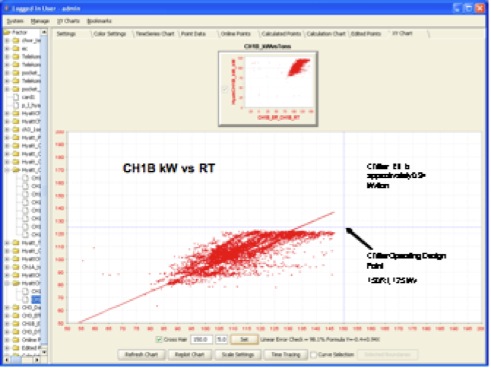
Figure 1: Chiller kW vs
Tons
The X-Y Chart is an actual Chiller Performance with Data
collected every minute. The main data cloud is in the
middle as expected.
However, notice how the chiller kW is limited to the design
limits (horizontal line)
and how it sometimes hits maximum power consumption
although cooling tons is
lower (upper left side of chart) - clear indication of
possible issues with condenser
water supply temperature or flow during certain periods of
operation.
One possibilty was an energy saving action which advocated
running lower
number of cooling towers in the morning to reduce fan
energy. Little knowledge
created a situation where fan kW savings caused higher
chiller kW and
lower performance level.
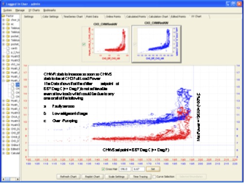
Figure 2: Chiller kW vs
CHWS Temperature
Another interesting chart where 2 chillers chilled water
supply (CHWS) vs kW
is placed in the same chart. This is used to compare
chiller performance. It can
be seen that the chiller with the red data cloud performs
better with lower CHWS
compared against the blue cloud chiller - same nergy
consumed but lower performance! (blue data)
Using such data, one can decide which chiller to run to be
more efficient. AND
incidently, this data showed that the chiller maintenance
crew forced a lower current
limit than the desired 100%! The right side of the chart
shows how current limiting or full
load operation starts the increase in CHWS temperature
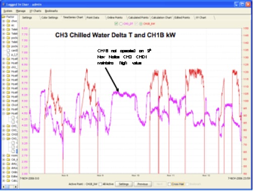
Figure 3: One-minuteMonitoring "catching" the load balance
of 2 chillers during normal days and weekends.
Data such as this helps determine which chiller should be
operated (if multiple sized system)
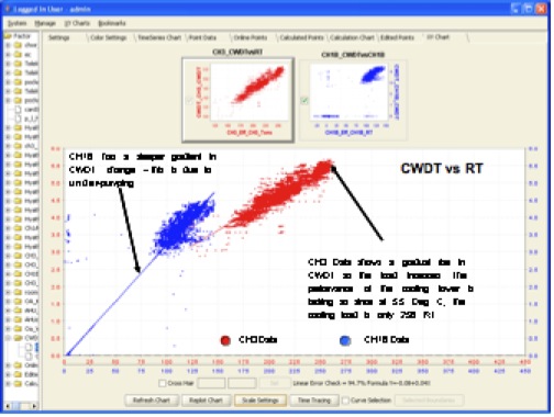
Figure 4: Chiller Performance charts - 2 identical chillers
compared side by side.
Data clearly shows how Condenser Water temperature effects
the
performance of a chiller. Using this data, we determined
that one set of
cooling towers had issues with the heat transfer rate and
it was narrowed
down to under- pumping, i.e. lower flowrate than design!
Coming
Soon! - How 2 Identical Centrifugal Chillers perform
differently due to faulty sensors and inaccuratevane
control